Week 2: Creating and Hosting a Website
📝 Pre-Class Preparation
Before the workshop, I prepared by exploring the basics of web hosting and file management. My goals were:
- Researching FTP: I watched tutorials on how File Transfer Protocol works to understand how files move from local to server.
- Environment Setup: I installed Visual Studio Code and FileZilla on my laptop to ensure I was ready for the practical tasks.
- Initial Doubts: I was curious about how the 'public_html' folder differs from a regular folder on my desktop.
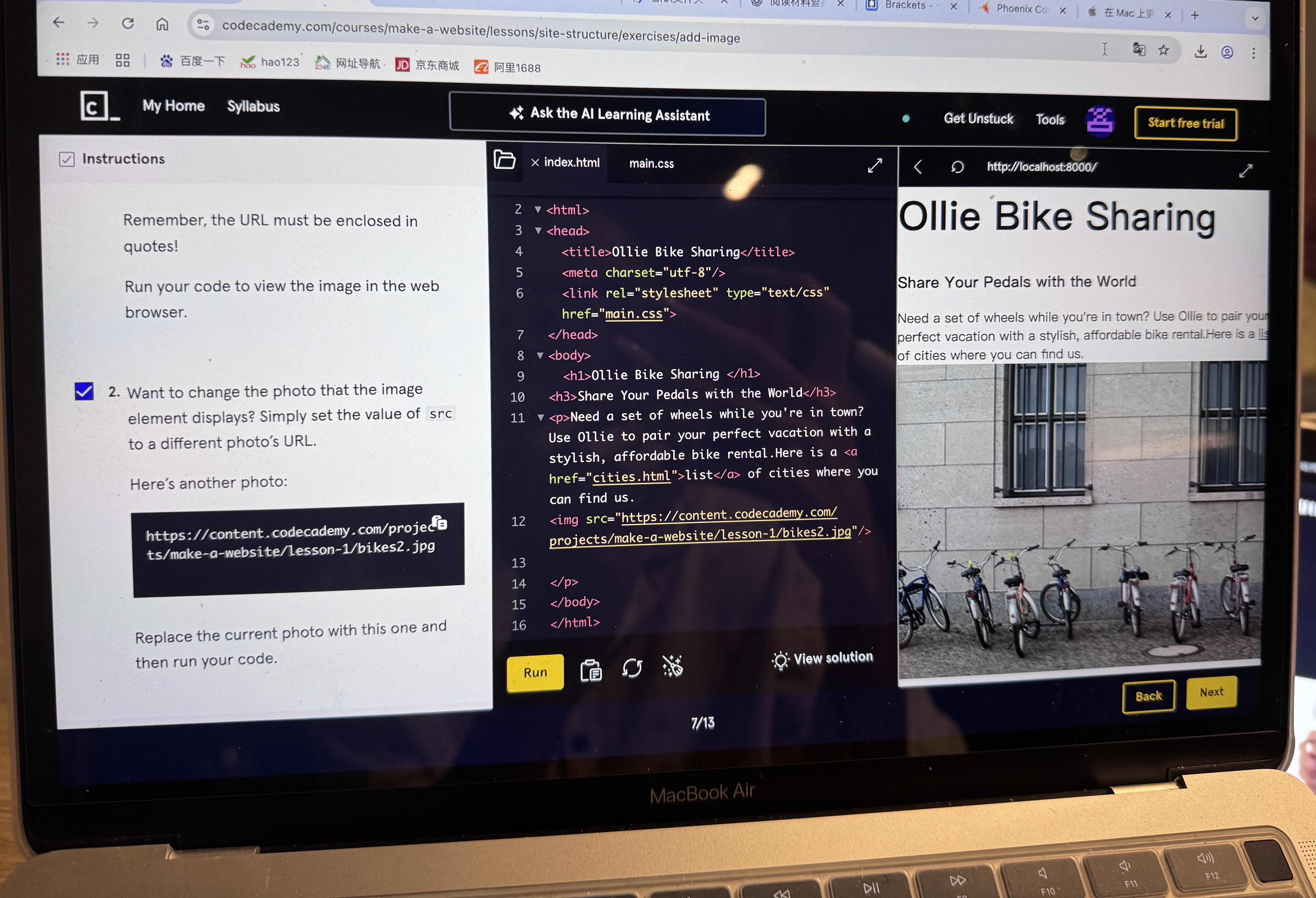
This week's workshop, 'Creating and Hosting a Website,' was a key starting point for my practical learning. It helped me move from just learning code to actually publishing a website online.
Key Learnings and Deployment:
- My biggest learning was definitely mastering the publishing pipeline. I successfully activated my `leedsnewmedia.net` hosting account and learned how to use SFTP (like FileZilla).
- This tool acts as a bridge, linking my computer files to the public `public_html` folder on the remote server.
Code Practice and Standards:
- Regarding the code itself, I focused on basic HTML structure. I practiced semantic organization by using correct heading levels (H1, H2, etc.).
- I also learned the simple but vital step of using the
<link>tag to connect my HTML file with an external CSS stylesheet.
Insights and Conclusion:
At the beginning, setting up the FTP connection and making sure all file paths were exactly right was a bit confusing. But the feeling of success when I saw my simple page live online for the first time was huge.
Overall, the main lesson this week is clear: a website must be not only written well but also successfully uploaded and stable. This project has immediately changed from just homework into the start of my continuous online portfolio, which I will use to show my digital media skills over the course.
Week 3: Web Scraping and Data Collection
Key Insights on Data Extraction:
- My primary learning was grasping that Web Scraping is the process of identifying, collecting, and saving specific data from a website's underlying code. This skill is crucial for converting non-structural web information into structured data for digital media research.
- The successful scraping process relies heavily on the consistency of the HTML/CSS structure. This highlighted the deep connection between web design and data analysis.
Reflections on Tools and Limitations:
- The WebScraper.io Chrome extension proved to be an excellent tool for quick entry, offering a low technical barrier and a visual selector. It effectively served as a learning platform to understand selector logic and the concept of data transformation.
- However, this practice also highlighted significant limits of web scraping: it is easily thwarted by anti-scraping mechanisms, dynamic content, and "cannot capture the context or user intent" behind the data. This reveals that much of the web's valuable data remains intentionally hidden or controlled by platforms, constraining independent research and mirroring broader **societal power dynamics** over information access.
Conclusion:
Week 3 functioned as a "dual-directional learning experience". While Week 2 focused on publishing digital content "to" the web, this week taught me how to systematically and analytically "retrieve" data "from" the web. This dual capability is foundational for modern digital media scholarship.
Week 4: Data, Ethics, and Critical Practice
This week’s course shifted our focus from coding and content publishing to data itself—specifically, how to design and examine the data collection process from a critical perspective.
Shifting Perspectives: World-Building and Quantification
Our group task was to design a survey based on a commercial scenario. The exercise taught me that data collection is never neutral; we had to constantly align our questions with the "commercial goal" of developing new products. The challenge of quantifying subjective experiences (like 'discipline' or 'frequency of use') revealed how platforms and social systems often "reduce the complexity of human life into finite, measurable categories" for marketing or control purposes.
- Understanding "World-Building": As emphasized in the course, designing a survey is an act of "world-building". Thinking in this outcome-oriented way was more challenging than simply writing code.
- Limits of Data Collection: The requirement to use numerical variables highlighted the "inherent limitations and potential biases" built into any attempt to quantify complex human behavior.
Key Insight: The Responsibility of Data Design
In summary, Week 4 marked a significant shift from a "technical mindset" to a "data mindset". We didn’t just learn how to design a survey—more importantly, we learned that data collection is a "critical and ethically responsible practice". Every piece of data recorded reflects the purpose and perspective of the collector, emphasizing the need for "fairness and transparency" in data design and its subsequent use in social systems and platform development.
📊 Data Collection Instrument
To understand student perspectives on AI web creation tools, we designed a specific questionnaire. You can view the original form structure and logic by clicking the button below:
View Survey Questionnaire →Sample Survey Questions:
- What level of education are you in right now? (Single choice: High school, Undergraduate, Graduate student, Others)
- What's your discipline?
- How often do you need to create websites for your studies or projects?(Scale: Very often, Sometimes, Rarely, Never)
Survey Results Data:
The raw data collected from 12 participants regarding their use of AI in web creation.
| Respondent ID | Education Level | Discipline | Creation Frequency | Attitude towards AI | Used AI Tools? | Tools Used | Intended Use | Professionalism Required | Useful Features | Perceived Helpfulness | Willingness to Pay | Reasonable Pricing |
|---|---|---|---|---|---|---|---|---|---|---|---|---|
| 1 | Graduate student | Digital Media | Very often | Neutral | No, not at all | Learning web design or coding;Personal projects or hobbies; | Moderate | Custom design styles (colors, layouts, etc.); | Neutral | Yes | $2–5/month (basic features) | |
| 2 | Graduate student | Digital Media | Sometimes | Neutral | No, not at all | My portfolio or graduation project;Class assignments or reports;Club or team websites; | Moderate | Auto-generated front-end code (HTML, CSS, JS);Custom design styles (colors, layouts, etc.);One-click website deployment;Ready-to-use templates; | Neutral | Maybe | One-time purchase | |
| 3 | Graduate student | digital media | Sometimes | Neutral | I’ve heard of them but never tried | School-provided tools; | Learning web design or coding; | Moderate | Custom design styles (colors, layouts, etc.);Auto-generated front-end code (HTML, CSS, JS); | Somewhat helpful | Maybe | $2–5/month (basic features) |
| 4 | Graduate student | dm | Sometimes | Not supported | I’ve heard of them but never tried | Notion AI / Wix ADI / Framer AI;School-provided tools; | Other;Personal projects or hobbies; | Moderate | Auto-generated front-end code (HTML, CSS, JS); | Neutral | Maybe | $2–5/month (basic features) |
| 5 | Undergraduate | Digital Media | Sometimes | Somewhat supportive | Occasionally | ChatGPT / Copilot; | Learning web design or coding; | Moderate | Auto-generated front-end code (HTML, CSS, JS);Ready-to-use templates; | Somewhat helpful | Maybe | $2–5/month (basic features) |
| 6 | Graduate student | Digital Media | Sometimes | Not supported | I’ve heard of them but never tried | School-provided tools;Notion AI / Wix ADI / Framer AI; | My portfolio or graduation project;Learning web design or coding;Personal projects or hobbies; | High | Custom design styles (colors, layouts, etc.); | Somewhat helpful | Maybe | Free with ads |
| 7 | Graduate student | MA digital media | Sometimes | Neutral | Occasionally | ChatGPT / Copilot; | Learning web design or coding; | Moderate | Auto-generated front-end code (HTML, CSS, JS);AI writing help for content; | Somewhat helpful | No | |
| 8 | Graduate student | MA Digital Media | Rarely | Somewhat supportive | Occasionally | ChatGPT / Copilot; | My portfolio or graduation project;Learning web design or coding;Personal projects or hobbies;Club or team websites; | High | Custom design styles (colors, layouts, etc.);Auto-generated front-end code (HTML, CSS, JS);Ready-to-use templates;Academic or project content integration; | Somewhat helpful | No | |
| 9 | Graduate student | Digital Media | Sometimes | Somewhat supportive | Occasionally | ChatGPT / Copilot; | Class assignments or reports;Learning web design or coding;My portfolio or graduation project; | Moderate | Auto-generated front-end code (HTML, CSS, JS);Custom design styles (colors, layouts, etc.); | Very helpful | Maybe | $2–5/month (basic features) |
| 10 | Graduate student | Digital Media | Very often | Very supportive | Yes, often | ChatGPT / Copilot; | My portfolio or graduation project;Learning web design or coding;Personal projects or hobbies;Class assignments or reports; | Moderate | Auto-generated front-end code (HTML, CSS, JS);Custom design styles (colors, layouts, etc.); | Very helpful | Yes | $5–10/month (with templates & hosting) |
| 11 | Graduate student | Digital media | Sometimes | Neutral | Occasionally | ChatGPT / Copilot; | Learning web design or coding;My portfolio or graduation project;Personal projects or hobbies; | Moderate | Custom design styles (colors, layouts, etc.); | Somewhat helpful | No | |
| 12 | Graduate student | digital media | Sometimes | Neutral | Occasionally | ChatGPT / Copilot; | Personal projects or hobbies; | Moderate | Custom design styles (colors, layouts, etc.);Auto-generated front-end code (HTML, CSS, JS); | Neutral | No |
Week 5: Data Visualisation - From Numbers to Narrative
Reflecting on the Dataset and Fundamentals:
- Data Integrity Check: We reflected on the initial challenges of questionnaire design from Week 4. Converting the raw survey responses into visual formats required cleaning the data first, ensuring that variables like "Attitude" and "Frequency" were consistent.
- Core Concepts: We reviewed fundamental visualisation concepts: understanding the types of "variables" (numerical vs categorical) and selecting the right "chart types" to tell the story effectively.
📊 Practice Outcome: Visualising Student Perspectives
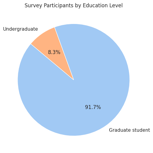
1. Demographics Overview
The Numbers: The pie chart shows the composition of our respondents.
The Narrative: As shown in the graph, the vast majority of our survey participants are Graduate Students. This context is crucial because it suggests our data reflects a highly educated group likely familiar with academic research tools, which may influence their adoption of AI.
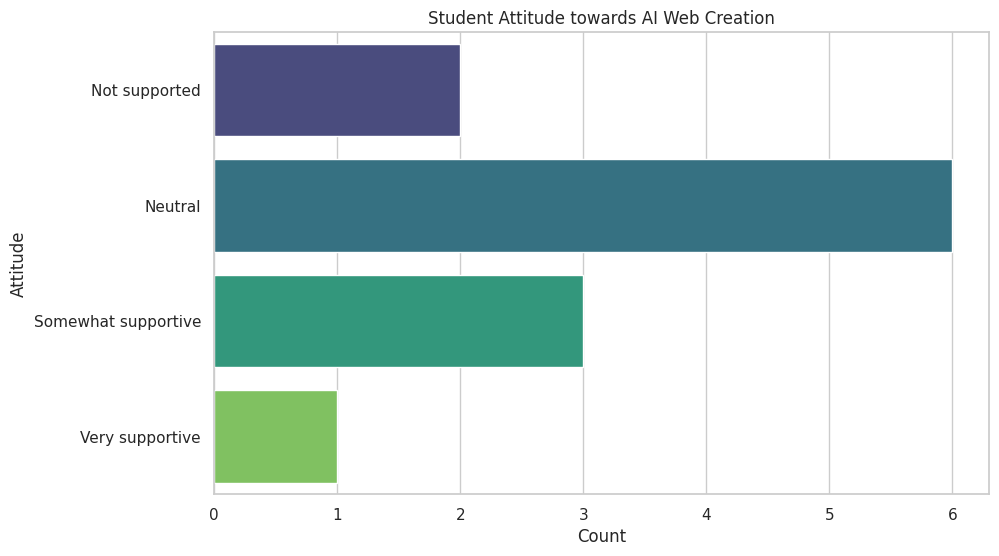
2. Sentiment Analysis
The Numbers: This bar chart maps out the "Attitude towards Webpage Gen-AI".
The Narrative: Interestingly, despite being Digital Media students, the dominant sentiment is "Neutral" rather than "Very Supportive". This visual reveals a sense of cautious optimism—students are aware of the technology but perhaps hesitant about its full reliability or ethical implications.
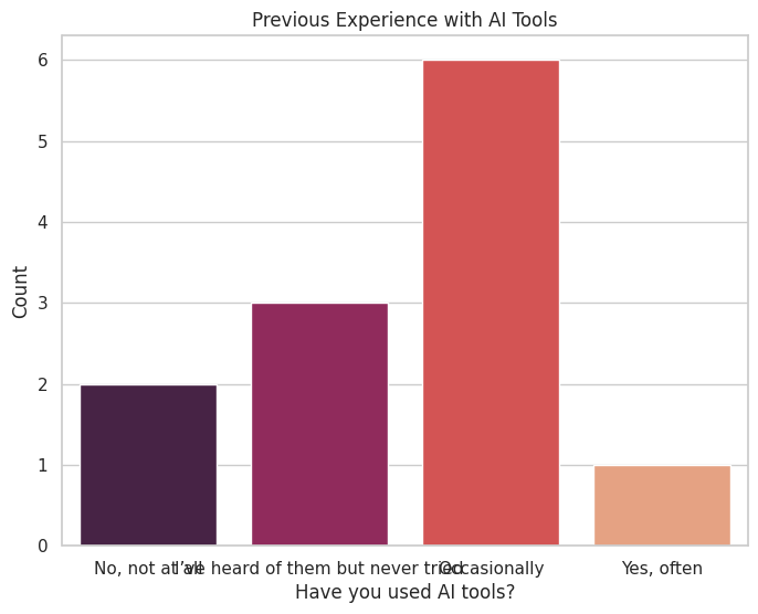
3. The Adoption Gap
The Numbers: We compared how many students have actually used these tools versus those who haven't.
The Narrative: The data tells a story of untapped potential. While many students have "heard of" these tools (as seen in the grey bars), regular usage is lower. This visualization identifies a "gap" between awareness and practice, suggesting a need for more hands-on workshops in our curriculum.
Visualisation as Research and Design:
- Narrative Purpose: As demonstrated above, data visualisation is a research method in itself. It helped me transform a spreadsheet of 12 rows into a clear story about "Student Caution" and "Adoption Gaps".
- Audience-Centred Design: A key takeaway was developing "audience awareness". By choosing simple bar charts and pie charts, I ensured the information was accessible to a general audience, making the insights immediate and persuasive.
Hands-on Tool Experience:
We practiced primarily with two tools: "Microsoft Excel" for basic descriptive charts (like the ones above) and "Tableau Public" for building interactive visuals. By intentionally connecting variables, we created visuals that better communicated our intended stories.
Key Insight: Visualisation as Critical Storytelling
In summary, Week 5 helped me recognize data visualisation as a form of "critical storytelling". Excellent visualization does more than display numbers; it requires a balance of analytical rigor and strategic design choices to guide audiences toward understanding and action.
Week 6: Identity, Algorithms, and Data
This week, the course explored the crucial concept of "algorithmic identity" and the mechanisms platforms use to categorize us. The goal was to move beyond simply using digital platforms to critically investigate how these systems understand and constrain our online actions.
Data Profile: Input and Output Analysis (Citing Gillespie and Cheney-Lippold)
The discussion reinforced "Gillespie's (2014)" definition of algorithms as procedures that select what is "most relevant from a corpus of data composed of traces of our activities." This data collection feeds a dynamic and fluid "algorithmic identity" (Cheney-Lippold, 2017).
- Input Investigation: I investigated my own data settings on a chosen social media platform, highlighting that platforms prioritize quantifiable activities and networks, often *not counting* complex non-conforming behaviors.
- Output Analysis: By examining my Google and social media ad profiles, I observed the 'output' of these algorithms. These categories, while intended to personalize advertising, often felt simplified or inaccurate, emphasizing the 'black box' problem—the processing logic remains hidden.
Deconstructing the Process: Manual Scraping and Limits
To try and understand the 'black box,' we undertook a practical exercise based on David Sumpter’s method. This involved a form of "manual scraping".
- The Task: I manually categorized 15 recent posts from 32 friends on a platform. The process immediately highlighted the "subjectivity and limits of data analysis". I faced challenges in assigning complex posts to only one category and realized that the initial categories were insufficient for capturing friends' diverse identities.
- Societal Insight: This exercise revealed how easily nuanced online behavior is "flattened into simple categories" for consumption and control, providing insight into the mechanisms behind modern "surveillance capitalism" and social sorting systems.
Reflecting on Data Categorization (Sumpter's Matrix):
| Case | Friend ID | Family/Partner | Outdoors | Work | Jokes/Memes | Product/Advertising | Politics/News | Music/Sport/Film | Animals | Friends | Local Events | Thoughts/Reflections | Activism | Lifestyle |
|---|---|---|---|---|---|---|---|---|---|---|---|---|---|---|
| 1 | ykyz | 3 | 0 | 0 | 1 | 0 | 0 | 0 | 8 | 2 | 0 | 0 | 0 | 2 |
| 2 | lbxj | 2 | 3 | 0 | 0 | 1 | 0 | 3 | 2 | 2 | 1 | 0 | 0 | 1 |
| 3 | qjbm | 1 | 5 | 0 | 2 | 3 | 0 | 0 | 5 | 0 | 0 | 0 | 0 | 0 |
| 4 | yihan | 0 | 6 | 0 | 0 | 2 | 0 | 1 | 2 | 2 | 1 | 0 | 0 | 0 |
| 5 | yangsun | 4 | 1 | 2 | 2 | 5 | 1 | 0 | 0 | 0 | 0 | 0 | 0 | 0 |
| 6 | marina | 5 | 2 | 0 | 2 | 4 | 0 | 0 | 0 | 0 | 0 | 0 | 0 | 3 |
| 7 | 九十六 | 2 | 5 | 1 | 1 | 2 | 0 | 2 | 2 | 0 | 0 | 0 | 0 | 0 |
| 8 | Laura | 0 | 0 | 0 | 5 | 0 | 4 | 0 | 1 | 0 | 2 | 3 | 0 | 0 |
| 9 | pppp.q | 0 | 0 | 2 | 1 | 5 | 2 | 0 | 0 | 0 | 0 | 1 | 2 | 3 |
| 10 | pbm | 1 | 0 | 3 | 1 | 3 | 0 | 0 | 2 | 0 | 0 | 0 | 2 | 3 |
| 11 | awai- | 2 | 1 | 4 | 0 | 0 | 3 | 0 | 1 | 3 | 0 | 2 | 0 | 0 |
| 12 | oni | 3 | 0 | 1 | 2 | 4 | 1 | 2 | 1 | 2 | 3 | 0 | 1 | 0 |
| 13 | 掌门人 | 0 | 2 | 3 | 0 | 0 | 0 | 1 | 6 | 2 | 0 | 1 | 2 | 1 |
| 14 | 万水千山 | 2 | 1 | 3 | 1 | 0 | 0 | 1 | 2 | 3 | 6 | 0 | 0 | 0 |
| 15 | cheers | 3 | 2 | 1 | 0 | 1 | 3 | 0 | 0 | 0 | 0 | 1 | 1 | 1 |
| 16 | 九九九六 | 4 | 3 | 2 | 0 | 2 | 0 | 0 | 0 | 1 | 2 | 2 | 3 | 2 |
| 17 | aprons | 0 | 4 | 0 | 1 | 2 | 1 | 5 | 1 | 2 | 0 | 0 | 0 | 3 |
| 18 | chunok | 6 | 5 | 0 | 2 | 0 | 4 | 0 | 1 | 2 | 1 | 1 | 4 | 0 |
| 19 | yii | 1 | 1 | 0 | 3 | 5 | 1 | 1 | 2 | 0 | 1 | 0 | 0 | 5 |
| 20 | abcd | 0 | 7 | 0 | 0 | 4 | 0 | 1 | 0 | 0 | 0 | 0 | 6 | 0 |
| 21 | Ry | 3 | 0 | 0 | 1 | 2 | 2 | 3 | 2 | 2 | 0 | 1 | 7 | 1 |
| 22 | JIa1 | 4 | 9 | 2 | 3 | 0 | 1 | 3 | 0 | 1 | 0 | 2 | 8 | 2 |
| 23 | 4uu | 0 | 1 | 1 | 3 | 1 | 2 | 1 | 0 | 0 | 0 | 3 | 9 | 5 |
| 24 | 4ever- | 0 | 5 | 2 | 1 | 0 | 3 | 2 | 0 | 2 | 0 | 4 | 2 | 1 |
| 25 | Duduu、 | 1 | 0 | 3 | 2 | 0 | 4 | 0 | 0 | 1 | 3 | 5 | 0 | 1 |
| 26 | YR | 8 | 3 | 4 | 0 | 1 | 5 | 0 | 2 | 1 | 2 | 6 | 0 | 0 |
| 27 | DoG | 0 | 0 | 5 | 0 | 2 | 1 | 0 | 1 | 6 | 2 | 7 | 2 | 0 |
| 28 | 雨 | 0 | 0 | 1 | 0 | 3 | 1 | 2 | 0 | 0 | 0 | 3 | 1 | 0 |
| 29 | mlll! | 2 | 0 | 2 | 1 | 0 | 1 | 2 | 1 | 1 | 4 | 0 | 0 | 0 |
| 30 | wWan | 1 | 1 | 3 | 2 | 0 | 2 | 0 | 1 | 0 | 0 | 5 | 2 | 0 |
| 31 | 黄宝宝 | 2 | 2 | 2 | 1 | 0 | 0 | 0 | 0 | 0 | 6 | 0 | 1 | 3 |
| 32 | baby | 1 | 0 | 3 | 2 | 0 | 2 | 2 | 0 | 1 | 7 | 1 | 1 | 2 |
Conclusion: Data and Responsibility
Overall, Week 6 marked a necessary shift to the "political, social, and ethical implications" of algorithms. The most powerful takeaway is that our online identity is not static; it is constantly being shaped by the algorithmic classifications that condition our digital experiences. As digital media students, we must understand the mechanics of this 'world-building' and the responsibility that comes with interpreting or designing data processes.
Week 7: AI as a Creative Tool and the Control of Digital Narrative
This workshop focused on the practical involvement of "AI in personal digital identity and the creative process". Through collaborating with AI on a personal story, I gained a deeper appreciation for how digital media creators can counteract the inherent "default settings" and predictive tendencies of Generative AI.
1. Negative Prompting and Content Control
The practice of "Negative Prompting" made me feel a tangible sense of "authorship".
- Resisting Homogenized Narratives: The AI's initial output often defaulted to the safest, most common (and least unique) story structures. I had to use a series of "exclusionary instructions" (negative prompts) to resist the AI’s "homogenizing treatment" of my personalized experience.
- Generating Computational Experience: I realized that my creative experience wasn't independent; it was generated through "constant negotiation, counter-action, and adjustment" with the AI's output. This interaction signifies a "new creative process", where I must clearly define "what I don't want" in order to achieve "what I need".
2. Digital Media Narrative and Heterogeneity
This activity allowed me to re-examine the relationship between "narrative, identity, and data" through a digital media lens.
- Predictiveness and User Experience (UX): The "predictive and probabilistic tendency" of AI is at the core of many digital platform UX designs. When we see recommendations that match our 'taste,' our algorithmic identity is confirmed. Through negative prompting, I actively attempted to break my story out of this "prediction loop."
- Introducing Creative Variance (Heterogeneity): To push the AI beyond its trained limits, I can experiment with prompts that include "contradictory, ambiguous, or unconventional style requirements". This forces the AI to make combinations at the edges of its knowledge distribution, introducing "heterogeneity" into the final digital media content and avoiding formulaic products.
3. Key Insight: Data's Dual Impact
In conclusion, this learning emphasized the "dual impact of data on digital media creation":
- On one hand, data drives powerful AI tools.
- On the other hand, it reduces users and creators to predictable labels (algorithmic identity), potentially "limiting creative freedom and information access".
As digital media students, we must master these tools, but more importantly, we must develop the "critical capacity to deconstruct and challenge" these underlying algorithmic structures.
Week 8: Digital Ecologies in Practice - Sensing More-than-Human Relations
This workshop provided a unique field practice at Kirkgate Market, guiding us beyond the digital screen to use our senses and digital tools to explore the "entanglements of human-food ecologies". The core aim was to understand how "Digital Ecologies" and our tools mediate our perception of the "more-than-human" world.
1. Entanglement of Senses and Digital Mediation
We practiced sensing the market with our bodies and capturing the environment with our phones (camera, recorder). This practice highlighted how digital technology shapes our experience:
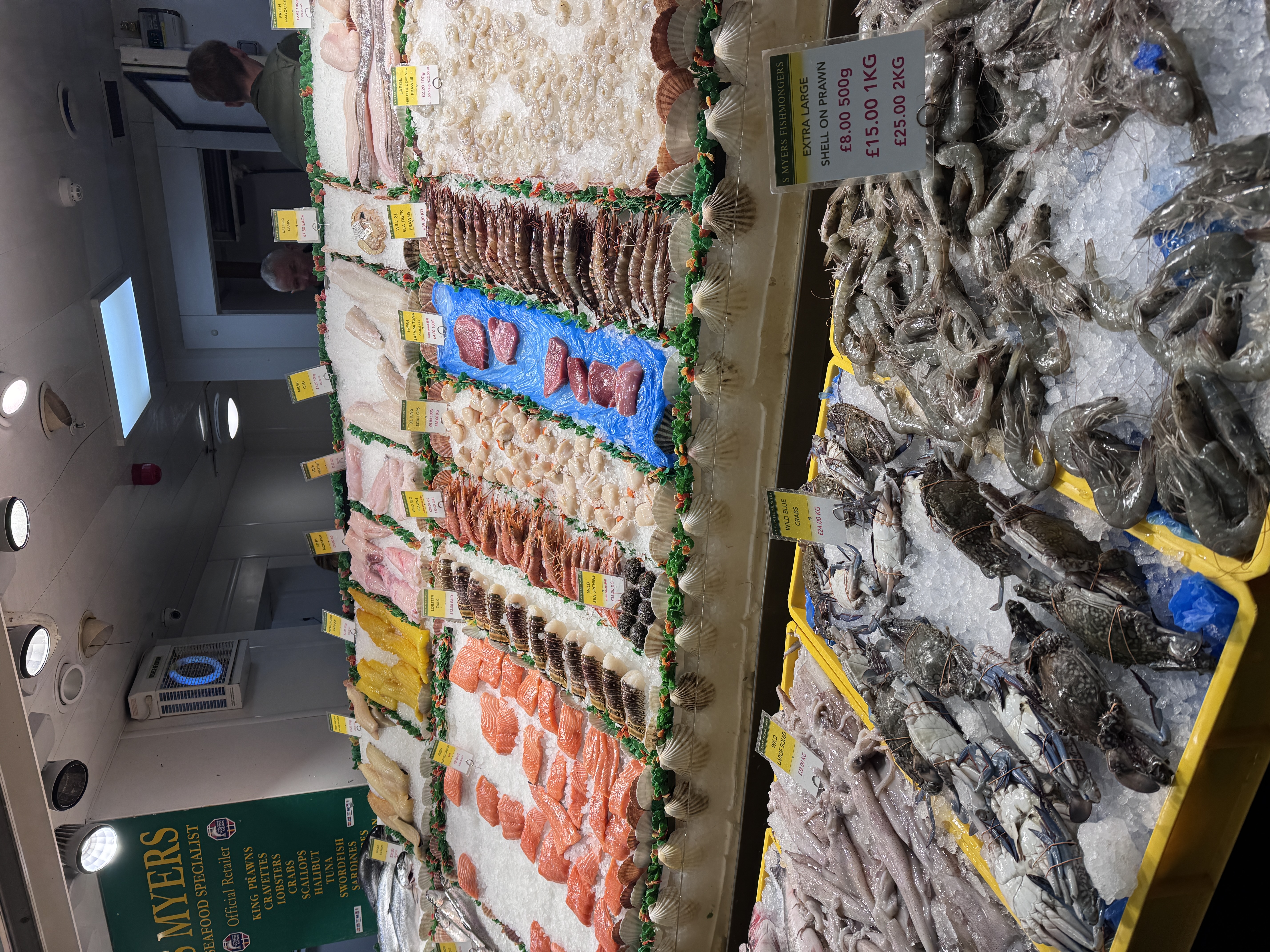
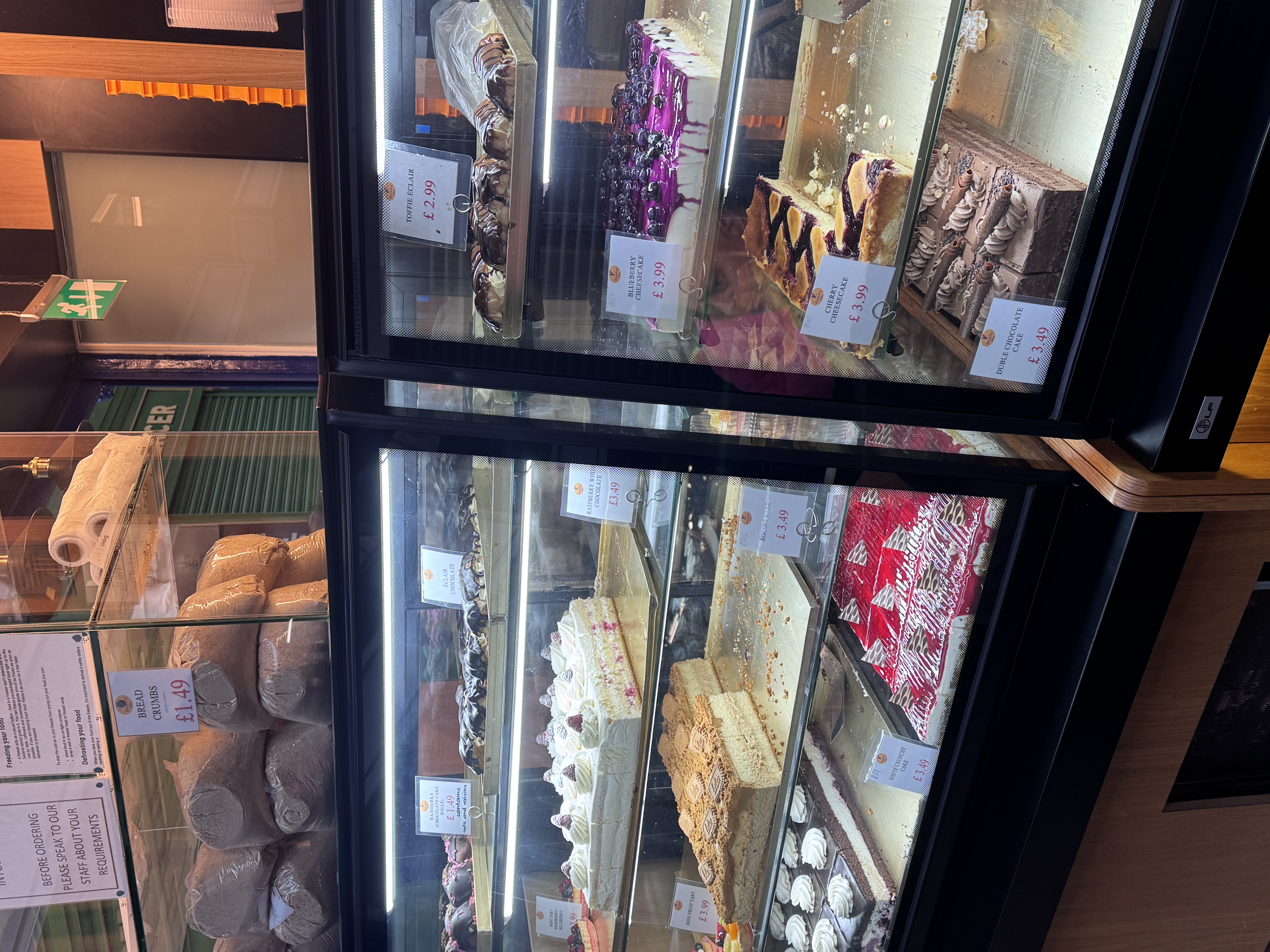
- Digital Focus: My attention was primarily drawn to capturing "visually perfect" food items or the "textual information" on packaging (e.g., origin, brand). This demonstrates how digital tools inherently favor visual and textual data, often silencing other senses.
- Sensory Shaping: As shown in Figure 2, I noticed the "warm yellow lighting" in the bakery was used to evoke feelings of warmth and appetite (visual design). While my phone captured the color, it could not record the heat or smell of the baked goods. This confirms "Davies et al.'s (2024)" argument that digitization amplifies certain senses while suppressing others.
- Embodied Entanglement: The entire market experience was not isolated. It was an entangled process where "me", my phone, the food, the light, the sound, and the ambient scent were all interconnected, forming a holistic ecological experience.
2. Uncovering More-than-Human Narratives and Inequity
By asking critical questions like "Where are these foods from? Who picked them?" I was forced to consider the complex more-than-human relations behind the food and the systemic flows of power.
- The Power of Data on the Package: The clear "origin information" (e.g., "From Africa") on the packaging is commercially designed and selectively presented data. The "unrecorded information" (e.g., labor conditions of pickers, carbon footprint of transport) is often intentionally hidden. This links back to the "data gaps and power asymmetry" discussed in Weeks 4 and 6.
- Artistic Intervention: Observing the spice installations, I reflected on "Bellet & Morgan's (2024)" methodology: how digital and artistic practices can be used to repair the human-food relationships simplified by commerce, fostering recognition of "multispecies entanglements".
3. Conclusion and Digital Media Responsibility
Week 8 significantly expanded my critical practice horizon. It serves as a reminder that as digital media students, our tools (cameras, recording apps, design software) are not just for creating content; they are "powerful mediators" that shape how we perceive and understand the world.
Our responsibility is to "critically employ these tools" to capture the simplified or overlooked sensory details and non-human narratives, thereby revealing the "systemic inequalities" hidden behind market, food, and technology.
Week 9: Creative Hacking – Sensing the Body with Arduino
This workshop was a hands-on introduction to "Creative Hacking" using the "Arduino environment", successfully connecting critical theory on the body with simple "digital engineering". The main task was the Love-o-meter, where we used a TMP36 sensor to measure and visualize a basic physical state: temperature.
1. From Abstract Data to Direct Sensing
The practice immediately shifted my focus from abstract web data (like in Week 3) to "direct, embodied sensing". The simple system perfectly showed the steps of digital mediation:
- Physical to Digital: The TMP36 sensor converts the continuous, physical temperature into an electrical signal. The Arduino then translates this messy, analogue input into neat, quantifiable digital numbers.
- System Logic: By manually connecting the sensor and writing the code's logic (the `if/else if` rules), I gained direct insight into how the system interprets my body. The code clearly defines the specific "thresholds" (e.g., `baselineTemp + 2`) that determine when a temperature change is considered "significant" enough to light up an LED.
2. Hacking the 'Black Box' of Measurement
Creative hacking, in this context, felt like an active way to open up and understand the technology that monitors us.
- Governing the Body: This highlights the fact that technological systems do not just measure our bodies; they govern how that data is counted and used. The temperature isn't just recorded; it's actively classified into defined categories ('low,' 'medium,' 'high') based purely on the programmer's choices.
- Critical Application: This mirrors how complex health and fitness data is reduced to simple, color-coded metrics by trackers. The experience reinforces the concern (from Week 6) that our bodies are constantly being flattened into controllable data streams by digital systems.
3. Conclusion: Empowerment and Responsibility
The core takeaway is empowerment. By understanding how to build the sensor and write the logic, digital media practitioners gain the knowledge to critically "deconstruct, modify, or create alternative sensing systems". This shifts the power dynamic, allowing us to move away from passive consumption and towards responsible, ethical engagement with the technology that measures our lives.
Week 10: Interactive Narratives and Ergodic Authorship
This workshop introduced "Interactive Narratives" using Twine, focusing on how digital media enables non-linear storytelling. The session centered on the concept of "Cybertext" (Aarseth, 1997) and "Ergodic Literature", where the reader's "nontrivial effort" actively shapes the story's progress and outcome.
1. Deconstructing Ergodic Literature
By completing sample Twine stories (like "Space Frog"), I analyzed how procedural authorship fundamentally differs from traditional linear narrative.
- Procedural Authorship: The original author (Murray, 1997) acts as the "choreographer", setting the context, rhythms, and possible steps. The reader, however, becomes the "improviser", making choices that define a unique performance within the system.
- Medium as Message: The power of "Cybertext" lies in its mechanical organization, where "hyperlinks and non-linear connections" are integral to the meaning. The number of choices available and the structural complexity (decision trees) directly control the reader's perceived agency.
2. Practical Creation with Twine
The group task required us to create our own interactive narrative about the Kirkgate Market visit (Week 8) using Twine, which formalized the theoretical concepts into practice.
- Engineering Narrative Flow: Planning the story structure required a decision tree template to plot multiple passages and ensure every interaction led to a clear (and sometimes surprising) destination. This exposed the technical difficulty of managing "non-linear complexity" without creating broken paths.
- Digital Storytelling Techniques: We implemented mandatory elements (ten passages, two fonts, one image) to learn Twine's basic functionalities for visual and structural variation. This demonstrated how simple "hyperlinks" become the primary mechanical tool for conveying meaning and allowing the 'reader' to traverse the text.
3. Conclusion: The Digital Author's Responsibility
Week 10 underscored the unique role of the digital author. Our responsibility extends beyond just writing compelling content; we must also procedurally choreograph the entire experience. This means:
- Anticipating Interaction: Designing the system to anticipate every possible choice the interactor might make.
- Ethical Pathing: Being aware that the narrative structure (the architecture of the possibilities) has ethical implications, controlling what information the reader receives and what consequences their choices bear.